

Showing posts with label infographics. Show all posts
Showing posts with label infographics. Show all posts
Monday, January 17, 2011
YOUR STOMACH VS STARBUCKS' TRENTA CUP (infographic)
Apparently nobody got the memo at Starbucks that their new cup size is bigger than the average stomach. Not to mention, Trenta = 30 in English. But the cup size is actually 31 oz. Looks like we have a 'cup size' fail. Via:Buzzfeed. Infographic Via The National Post


Thursday, May 13, 2010
CRACKDOWN: NYT FACEBOOK PRIVACY FLOW CHART
The good folks at the New York Times have broken down the dizzying array of privacy changes Facebook are implementing more and more regularly. In a time when consumers have control, or want control, Facebook might just be shooting themselves in the foot with their penchant to confuse and sell your personal data for profit. I remember when Facebook put their trust in user opinion. It seems the more Facebook tries to commoditize, the more they take advantage of the Facebook users that make their service thrive.
Interesting factoid: Facebook has a longer privacy policy than the United States Constitution
For full breakout image: NYT


Interesting factoid: Facebook has a longer privacy policy than the United States Constitution
For full breakout image: NYT


Tuesday, May 11, 2010
SWALLOW THIS: AMERICANS POPPIN' PSYCHIATRICS

Saturday, April 24, 2010
PIZZA, GUNS AND STRIP CLUBS: AN EXERCISE IN SEARCH
Great piece put together on location based web searches for a few of Americans favorite things.

via: Floating Sheep

via: Floating Sheep
Monday, April 19, 2010
FAT FOOD
Fast food eaters beware, this is why you're fat. Using KFC's absurd Double Down as a unit of measure, this infographic shows that maybe the Double Down isn't as shocking as we'd like to believe. Wendy's takes the cake with it's artery clogging Triple Baconator (which, if I'm not mistaken, is loaded with 12 strips of bacon, 3 squares of cheese, and lathered with mayonnaise). In fact, the fat alone bests the combined total for a Double Down. I've had the single, and even that gives me meat sweats. But man, is that flame broiled deliciousness worth the gluttony.
 Via: Buzz Feed
Wednesday, March 31, 2010
25 YEARS OF BRACKETOLOGY COMPRESSED INTO ONE
Leonardo Aranda took every March Madness Outcome from 1985 to 2009 to give us an insight into how each seed has advanced over the years. As we are all aware, no 16 seed has ever won in the tournament. The lowest seed to win a national championship? the 8th seed.
Via: Good

Via: Good

Monday, March 29, 2010
JAPAN-0-GRAPHIC
An eye opening videographic look into the weirdness that is Japanese culture. One fact: 26,000,000,000 chopsticks are used every year in Japan. Of those, 90 percent of these disposable wooden chopsticks are sourced from China. Enjoy!
Japan-The Strange Country (English ver.) from Kenichi on Vimeo.
Friday, March 12, 2010
THE BUCK PRAYS HERE

Thursday, March 4, 2010
POVERTY AND ORGASMS: OUR INFOGRAPHICS OF THE WEEK
The two biggest issues on the table right now could be wealth and satisfaction. Let's just say it is. In that case, It shouldn't be too long before an infographic comes along that demonstrates the correlation between the two shown below.
Via: Good/Wooster

Click here for full size image -------> Koldcast.TV

Via: Good/Wooster

Click here for full size image -------> Koldcast.TV
Tuesday, February 16, 2010
PAY TO PRESS PLAY
According to Nielsen, we're a lot more generous than the media would like to believe. Based on a poll of average internet users - those willing to pay for various media consumption they already get for free - people are actually quite content if the cost came right out of their pocketbooks.

Via: Mashable

Via: Mashable
Monday, February 15, 2010
DEVASTATION'S AFTERMATH
Information is beautiful has put together another piece, this time focusing on the devastation caused by the earthquake in Haiti. Via: Informationisbeautiful


Wednesday, February 3, 2010
HUMP DAY CRACKDOWN: THE STATE OF THE INTERNET
Ever wonder who's using this so called 'internet'? Focus.com did, and they have presented it to us in vivid infographic detail. Why speak any further, let's let the beautiful dots and colors guide the way along the super highway. (click image for greater detail)

Tuesday, January 26, 2010
NATIONAL GEOGRAPHIC SETS THE TEABAGGERS STRAIGHT
National Geographic has conducted an interesting study: Comparing the cost of health care around the world to each country's respective life expectancy. We already know the United States has the most expensive health care, but what's worse than overpaying for health care, living in a country that's in the bottom half in regards to life expectancy. Put that in your Tea Bagging pipe and smoke it.

Sunday, January 24, 2010
THE BEATLES GET THE INFOGRAPHICS TREATMENT
Tripped out infographics from informationisbeautiful takes a visually detailed look at practically every measurable facet of the Beatles music. From what key each song was recorded in to what time and where you could find them at any time. In the studio, making movies and on tour.


Friday, January 22, 2010
GET A ROOM


Tuesday, January 19, 2010
SLICE THROUGH THE GARBAGE
All those ads are spouting whatever these days about their cell service. Here's a broken down version of the actual cost comparison thanks to Bill Shrink. De Nada. Por Supesto. You're welcome.


Thursday, January 7, 2010

Tuesday, January 5, 2010
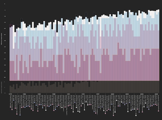
POP MUSIC ISN'T GOING AWAY BUT IT'S GETTING LOUDER
A Closer and colorful way to look at pop music loudness since 1979. Image 2 is the graph key and image 3 is a sample of the artists pictured in image 1. Trip out.


http://images.fastcompany.com/upload/Loudness2JPEG.jpg
Monday, January 4, 2010


Subscribe to:
Posts (Atom)
